I first saw Jordan Raskin’s work on AVP at Dark Horse Comics and I was instantly blown away by his work. From there on I followed his work to Image and some killer artwork on Ripclaw. Whenever I see his name attached to a book I will buy it regardless of who’s writing it. His art impresses me that much. His work is truly something to see.

Batman – private commission
First professional work (piece / year) and the story behind it.
Wow, you’re taking me back. My first professional comic work was for a small indie publisher based in NYC called “Evolution Comics”. The book was a mini B&W anthology and the character I drew was called “Vidorix the Druid”. The writing was well researched and it was a fun character — kind of a cross between “Name of the Rose” and Dr. Strange. Anyway, I met the publishers at a small NY comic-con. I drew 4 issues for them and we toured some small east coast comic conventions together. Fun times, it was all so new to me. Vidorix was my art school. I did a lot of learning on that title.
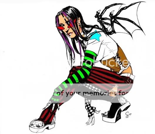
 Ripclaw special (Top Cow) – Page 31 & 32
Self-taught or formally educated? (or mixture of both, mentors etc…)
Largely self-taught, but technically I did attend both Joe Kubert’s school of Cartooning and Ringling school of illustration for one semester each.
Tools of the trade: Taking a quick glance over at your pens, brushes etc…what tools have you mainly been using over the last few years?
Ink-wise I’m a brush man. Used to love Raphael #4’s with Black Magic india ink. But because my pencil work is as tight as it is, these days I’ve been trying to cut out the ink stage. My most recent work was drawn with black Prismacolor pencils on vellum. When handled with care, you wouldn’t know it wasn’t ink.

Ripclaw promo
Favorite brand of ink:
Black Magic
Type of paper:
Seth Cole Duralene vellum.

Industry of War issue 1 pg. 2
Which artists or creators do you return to for a quick boost of inspiration? Who are YOUR masters of ink?
(in no particular order) Jorge Zaffino, Kevin Nowlan, Neal Adams, Mark Beachum, Frank Frazetta, Sergio Toppi — to name a few.
Once a client has handed off an illustration job to you, how do you first tackle the job. A quick overview of your process.
I’ll start with thumbnail layouts (drawn to scale). Once I’ve settled on a design I’ll submit it for approval. Once approved I enlarge the layouts to original art size and tape my vellum (effectively bristol board quality tracing paper) over the layout and complete the finished line-art from there.

Industry of War issue 2, pg. 4
What’s currently sitting in your mp3 / CD player / turntable?
Well, considering I have a 200 gig iPod, a lot! Too much to break down, but let’s just say my music tastes are firmly rooted in the 70’s and 80’s. I’ve also always been fond of listening to movie soundtracks — especially when writing or working on layouts.

Marvel Tombs of Terror
What’s hanging on your walls and what is your favorite piece of art that you own (not created by you)?
Framed signed/numbered Death Dealer print by the late great Frank Frazetta.
Last novel you read and last movie that you saw (that you’d recommend)?
I don’t really read novels so much as listen to them as audio books (it’s a multitasking thing). Nothing in particular to recommend at the moment, but I do love me some Tom Clancy. Start with The Hunt for Red October and work your way up — you won’t regret it. Last movie I saw was Inception.

Ripclaw cover
Current and upcoming projects:
Werewolf by Night for Marvel’s “Tomb of Terror” (B&W horror anthology available in October). Upcoming project is a question mark. I’m considering pitching a tale for Heavy Metal but I’m also considering doing some storyboard work for film and animation.

Marvel Tomb of Terror
What would you tell an aspiring artist who is working his ass off but still needs and wants to break through to the next level?
Chuck Jones (famed animator) once said: “You’ve got 100,000 bad drawings in you and it’s best to get them out as fast as possible”. Practice makes perfect. These days, however, it’s just as important to learn digital programs as it is to become a good draftsman. It’s important to think of yourself as a commercial artist, not a comic book artist. Comics alone will not pay your bills. Learn other things besides comics. Also, make sure you spend time networking. Relationships get you jobs more so than your portfolio.
Find out more about Jordan Raskin by heading on over to his website.

Vampirella vs. Dracula cover


 By Richard Serrao and Jason Thibault


Recent Comments