Rebel Art, Indie Spirit, Outlaw Marketing - Since 2005

June Contest #1 Win an Original Pen and Ink Drawing

We`ve finally arrived at the first contest ever held at this website.
We’re pretty stoked around here about the impending release of Optimum Wound Volume One in early September. It hits the Previews catalog on June 24th.

So we’re celebrating by holding contests all month.
This will be the first of four held in June. Every Friday we`ll be offering up prizes of escalating coolness. This week features a 11″ by 12″ pen and ink drawing. You can win this artwork by following the rules below.

contest 1 starkweather uzis 1 June Contest #1 Win an Original Pen and Ink Drawing

It’s a drawing of my main character Starkweather from Battles Without Living Witnesses. It’s 12 inches tall and 11 inches wide (30cm x 27.5cm), India ink on acid-free paper. AND IT”S YOURS TO WIN.

June 2009 contest 1 rex June Contest #1 Win an Original Pen and Ink Drawing

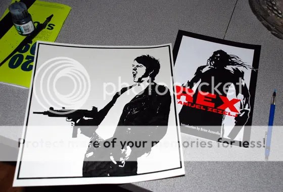
As an added bonus I’ll throw in a copy of Danijel Zezelj’s Rex in the package.

THE RULES

Just answer this question in the comments section.
What have you accomplished so far in 2009 that you’re most proud of?

1. Just leave a comment on this blog, that’s it.
2. You’re only allowed to post once. I read every comment so I’ll know.
3. Private messages or emails don’t count, it has to be posted on this blog.
4. You have to leave a comment before 11.59pm PST on Monday, June 8th, 2009 to be eligible. I’ll add up the number of comments and use a random number generator to select the winner. Then I’ll contact the winner by email and announce them publicly next Friday, June 12th on the Contest #2 blog.
5. This contest is open to ANYONE in the world. If I have to pay shipping to South Africa or New Zealand, that’s MY problem.

Good luck everyone.
-Jay

Five Reasons to Draw with Pen and Ink on Paper (and sometimes big)

pen nibs featured content Five Reasons to Draw with Pen and Ink on Paper (and sometimes big)

by Jason Thibault

Now that computers and the internet have overtaken the world I sometimes fear that a lot of the traditional things that we take for granted will slowly begin to disappear. It may be an irrational fear as the internet has also brought to light amazing factions of creators in different pockets of the globe.

I’ve been noticing new practices taking hold in the comics, manga and illustration professions. Digital inking, Wacom tablets (yes they are cool) replacing pens, vectors overtaking hand-drawn artwork and a strong reliance on Illustrator and Photoshop. Don’t get me wrong, this is not a knock against utilizing those techniques. I have seen some amazing art created on Macs and PCs. I just don’t want it to get too carried away. I have never personally experimented with digital drawing suites like Manga Studio and I will one day when I get the time. For now I continue to love getting my hands dirty with ink and owning a growing collection of original pages and illustrations.

The main reasons to draw by hand

1. Permanence. If you create your pages with a half-decent ink on acid-free paper your artwork will survive for decades and perhaps centuries. Paper is still the most portable storage format. Digital works are stored on your hard drive, CDRom, DVD or back-up tape. But digital file types and storage mediums change each decade. We backed up files on tape in the 1980′s and part of the 90′s. Then we used zip cartridges. Then DVDRoms and portable hard drives. Meanwhile paper is still paper. My stack of originals is nicely filed away in a flat drawer. I still like to keep photocopies and high resolution digital backups though just in case.

history of tape storage Five Reasons to Draw with Pen and Ink on Paper (and sometimes big)

2. Mastering techniques. I realize it takes years and a lot of artistic skill to render quality digital paintings and drawings but there’s just something more immediate about pen on paper or brush on canvas. Whether it’s spending years figuring out how to perfectly sharpen your pencil or the exact pressure needed when drawing lines with a dipping nib or technical pen. It could involve changing up your ink brand, paper type and size or finally investing in some high quality Windsor & Newton watercolor brushes. I’m sure we’ll arrive at a day where students will sit around a live model and sketch them with their wacoms into a laptop. I just hope that day doesn’t arrive too soon.

3. The monetary value of having an original. I realize most art out there isn’t worth much more than the paper or canvas that it was created on and that’s often not the point when creating it. But what about down the line? What if the creator strikes it big? Having a back catalog of originals could become quite lucrative in that case. The idea of parting with my originals pains me but my grandkids might not have the same issues. And although I know it’s happened, it’s not often that we visit a gallery to view a showing of digital print-outs.

4. Drawing Big. Once again I realize a computer screen can become an infinite canvas if you zoom in and out far enough. But the sheer power of wild brush strokes on a larger sheet of paper still captivates me. I was so used to crafting comic pages on 11″ x 17″ sheets that I thought I may be confined to those dimensions forever. Then I went to a few comic art exhibits. I saw original pages by Dan Clowes and Chris Ware which were much larger. It completely changed my mindset. And seeing that Paul Pope creates comics on pages as large as 19″ x 24″ was a revelation. And in the art world larger sized works often do command higher prices.

5. Having a completely portable skill set. If you can draw you can draw anywhere. If you’re well practiced with pen or pencil you can draw in your studio, at a cafe, park, bus station, prison etc… No need to boot up software or rely on electricity. Back in the 1990′s R. Crumb traded in a box of sketchbooks for a villa in France. You probably won’t be able to trade in your old laptops and digital printouts and get the same deal.

man sketching Five Reasons to Draw with Pen and Ink on Paper (and sometimes big)

A Pen and Ink Love In
I wanted this particular blog post to be more of a celebration of the amazing array of hand-created artwork that’s out there and specifically works that are rendered in pencil, pen and ink. I’m hoping the next generation of art students and bedroom illustrators embrace the techniques of the past as they forge on ahead crafting new styles and merging the practical with the digital.

In this next part I’m going to focus on comic artists but I’ve mixed in a couple of poster artists and illustrators as well. I’ve kept the number down to around a dozen artists but I could have easily put 50 or 60 (or 500 or 600) more up here. Every artist listed below is one that I hold in high regard. Some have influenced me while others I simply stand in awe of to both their talent and dedication to their craft.

Florian Bertmer
Florian Bertmer is an incredible draftsman who’s taken influences such as Pushead but run with it into a darker direction. He’s a German artist who creates art for posters, t-shirts and album covers.

florian bertmer baphomet Five Reasons to Draw with Pen and Ink on Paper (and sometimes big)

Paul Pope
Paul Pope is the perfect melding of European, Japanese and old-school American cartoonists. And he draws big. On his large-sized boards he deftly creates his comic book masterpieces. He’s one of the aforementioned artists that I simply stand in awe of. The good people at First Second books will be releasing his out of print series THB this fall. The Beguiling comic shop in Toronto has a lot of his art for sale.

paul pope batman 100 Five Reasons to Draw with Pen and Ink on Paper (and sometimes big)

Aaron Horkey
There’s no point in trying to ever draw more detailed than Aaron Horkey. His unique artwork adorns record covers, t-shirts and fast to sell-out prints. There’s nobody out there quite like him. His hand-lettering is elegant enough to make dozens of artists want to quit and change professions. His ink illustrations are so intricate that they actually blow the art up in size (rather than the standard procedure of reducing) before printing it. I’m the proud owner of several of his silk-screened prints which is the only affordable way to obtain his art. His originals fetch thousands of dollars when you can manage to find one for sale.

aaron horkey catalyst Five Reasons to Draw with Pen and Ink on Paper (and sometimes big)

aaron horkey detritus line art Five Reasons to Draw with Pen and Ink on Paper (and sometimes big)

aaron horkey diesel show Five Reasons to Draw with Pen and Ink on Paper (and sometimes big)

Jae Lee
I’ve been in love with the art of Jae Lee ever since first buying up all of the issues of Namor that he worked on in the early 90′s. Despite the murky coloring and poor-quality newsprint that Namor was printed on his edgey style cut through. He became a fan favourite while he was very young. He continually refined his style by at first taking a looser approach following after Bill Sienkiewicz, Barron Storrey and Kent Williams. After a hiatus he came back in the early 2000′s sporting a more realistic approach yet still with the jagged edges and razor thin lines that he was always known for. He must have gone through an oil tanker worth of black India ink throughout his career.
In 2006 it was announced that he would be providing art for the Marvel adaptation of Stephen King’s Dark Tower series. He worked strictly in pencils for this project and colorist Richard Isanove darkened his grey tones to black in Photoshop and went to town with them. Check out his originals at the Albert Moy Gallery.

jae lee dark tower gunslinger Five Reasons to Draw with Pen and Ink on Paper (and sometimes big)

jae lee wolverine Five Reasons to Draw with Pen and Ink on Paper (and sometimes big)

Lee Bermejo has risen to the cream of the crop of the comix industry. He came out of the gate around 10 years ago working for Wildstorm where his work looked like it had been created by a seasoned pro despite his young age. You don’t hear much from him on the interwebs. We snagged an interview with him recently but he has no website or much of a presence online. You can however find his gallery over at Splash Page Art. I’m guessing he’s too busy busting out insane amounts of detail on his artwork to bother much with the internet. His graphic novel Joker (written by Brian Azzarello) was and is a bestseller. It hit stores shortly after The Dark Knight was in theatres.
As amazing as he is with pen and ink it’s his recent style that he’s been developing over the last few years that has found him new fans. He creates textures and layers with pencil and then highlights and outlines the shapes with ink.

lee bermejo the stand 4 cover Five Reasons to Draw with Pen and Ink on Paper (and sometimes big)

lee bermejo joker 1 Five Reasons to Draw with Pen and Ink on Paper (and sometimes big)

Brian Hitch made everyone in comics take notice of him and his art when he joined Warren Ellis for the first 12 issues of The Authority. The two of them helped to make famous the more cinematic “widescreen” approach of comics in the late 1990′s. But it was his five-year run with Mark Millar on Marvel’s Ultimates that sent his name soaring into the stratosphere. His masterful combination of exaggerated super-heroic realism pushed front and centre over painstakingly rendered backgrounds has won him hundreds of thousands of admirers. And artist Paul Neary must have the patience of a Buddhist monk to have inked a lot of those pages.
You can find a lot of Hitch and Neary original art over at The Art of Comics. And if you have a spare two or three grand sitting around you could commission an original.

bryan hitch ultimates 2 13 2 Five Reasons to Draw with Pen and Ink on Paper (and sometimes big)

Tim Bradstreet
It’s no secret to anyone who’s followed Optimum Wound for a while that we’re big fans of Tim Bradstreet’s artwork. When I happened upon his book Maximum Black I was immediately inspired to start experimenting with realism and photorealism and I haven’t looked back since. Tim’s style has also evolved over the years and his graphic design skills are razor sharp. He’s brought a movie poster and book jacket sensibility to comic covers and won himself a legion of fans in the process.
Tim Bradstreet’s art is always a source of inspiration around these parts.

tim bradstreet punisher movie tease Five Reasons to Draw with Pen and Ink on Paper (and sometimes big)

tim bradstreet punisher comicbox Five Reasons to Draw with Pen and Ink on Paper (and sometimes big)

Geoff Darrow
I was blown away by the art of Geoff Darrow from the first moment a friend showed me a copy Hard Boiled. I needed to see more. Unfortunately Geoff takes a long time to create his painstakingly detailed artwork. The originals (that I’ve seen listed on eBay) are massive in size. I believe the pencils are done on illustration paper and then the inks are drawn on a vellum overlay. He could have rested on his laurels after working on the production designs for the Matrix trilogy but he cut no corners when working on his most recent series, Shaolin Cowboy.

geoff darrow hard boiled Five Reasons to Draw with Pen and Ink on Paper (and sometimes big)

geoff darrow hard boiled 2 Five Reasons to Draw with Pen and Ink on Paper (and sometimes big)

Sean Phillips
Sean Phillips is one of the most reliable artists current working in comics. Whether he was working on one of my favourite series of the past decade, Sleeper or earning a bigger paycheque on Marvel Zombies I am always inspired by the results. He described the look of his style on Criminal as Kent Williams inking Mike Mignola. He has a nice chunky realistic style and extremely intuitive design skills when it comes to laying out panels on a page. He’s also quite an accomplished painter. You can go to Splash Page Art to see Sean Phillip’s gallery of originals for sale.

sean phillips criminal Iss 10 Pg 25 Five Reasons to Draw with Pen and Ink on Paper (and sometimes big)

Sean Phillips Batman Jekyll and Hyd Five Reasons to Draw with Pen and Ink on Paper (and sometimes big)

Bill Sienkiewicz has always been one of my absolute favourite artists. I treasure my copies of Elektra Assassin. I feel he’s the artist mainly responsible for bringing the look of organized chaos to mainstream comics. Melding the bold illustration styles of the 1980′s with Neal Adams, Ralph Steadman and probably a million other influences Bill knocked us on our asses with his wild drawings and layouts. From his more realistic subject portrayals in his commercial art projects to his “far-out” experiments in series like Stray Toasters he has never let us become bored with him.
It’s his collaborations with Alan Moore on Big Numbers and Brought to Light that really did it for me and showed what could done with the comics medium.

bill sienkiewicz bruce wayne gotham Five Reasons to Draw with Pen and Ink on Paper (and sometimes big)

bill sienkiwicz batman arkham Five Reasons to Draw with Pen and Ink on Paper (and sometimes big)

And finally I’ll leave you with a piece called Lafourcade II by an art collective known as Anville. This is a 16″ x 40″ ink on bristol drawing. The detail is staggering on it.

anville lafourcade ii Five Reasons to Draw with Pen and Ink on Paper (and sometimes big)

And of course need we mention…
Jason Shawn Alexander
jason shawn alexander dead irons 4 Five Reasons to Draw with Pen and Ink on Paper (and sometimes big)

and Danijel Zezelj
danijel zezelj king of nekropolis p Five Reasons to Draw with Pen and Ink on Paper (and sometimes big)

So what compels you to keep drawing?

Photography Credits:

Both photos at the top were used under a Creative Commons License.
The History of Tape Storage, photo by Pargon
Photo of man sketching by sashafatcat


tweet it button Five Reasons to Draw with Pen and Ink on Paper (and sometimes big)

ANATOMY OF A PAGE: A PROCESS BLOG FOR PAGE 22 OF BATTLES

This was an older process blog that I had done in early 2006. It was sitting out there lost in the Myspace archives. I had a lot of fun putting it together so I dusted it off and put it back up.

3252539022 beaaa516b5 o ANATOMY OF A PAGE: A PROCESS BLOG FOR PAGE 22 OF BATTLES

I wanted to discuss the process behind a page that I drew for my online graphic novel.
Things were about to get rather violent in the story and I wanted to create a dramatic page using techniques I either hadn’t explored before or at least hadn’t used in years.
I layed out the basic page in pencils using an HB lead in a STAEDLER MARS 780 mechanical pencil holder. I use those for all of my pencils.

3252539082 35e0e38e8d o ANATOMY OF A PAGE: A PROCESS BLOG FOR PAGE 22 OF BATTLES
You have to constantly sharpen these babies or have a rotation of 2 or 3 lead/holders going at all times. They get dull rather quickly. I don’t fill in the pencils but will sometimes leave x’s where large surfaces needed to be coated in black ink.
3251713697 4d3b52e5e1 o ANATOMY OF A PAGE: A PROCESS BLOG FOR PAGE 22 OF BATTLES
I stick closely to the pencils for inking. I draw in the thinner lines with a Hunts 102 Crowquill nib dipped in KOH-I-NOOR drawing ink. Then I follow that with thicker lines drawn in with a Hunts 108 nib.
I follow that with a piece-of-crap number 2 watercolor brush and go to town on the heavy black areas.

3251714001 abf80d740a o ANATOMY OF A PAGE: A PROCESS BLOG FOR PAGE 22 OF BATTLES
This is where the fun really starts.
I went to Kinkos and made four or five 11×17 photocopies of the inked page.
I hadn’t played with ink spattering for a few years and I didn’t have the balls to try it on the original art page so I went nuts on the photocopies.
1. I took an old toothbrush and filled it with India ink. I let her rip. I had to try it on several of the copies as my first attempts were disastrous.
2. I then took some of the scratchboard tools that I had in my inventory and ferociously cut lines through the SWAT trooper’s arm and torso.
3. From yet another photocopy of the original art I cut out the hand and gun from panel one and scotch-taped it onto panel two in front of the SWAT trooper’s head.
4. Finally I scanned in the results of the scratched, pasted and spattered 11×17 photocopy into our huge 12×17 inch tabloid scanner.

3251713877 cc2b22e41a o ANATOMY OF A PAGE: A PROCESS BLOG FOR PAGE 22 OF BATTLES
Here’s a closer look at the hacking and slashing I did on the ink work with a scratchboard knife.

3251713819 7d1dc19688 o ANATOMY OF A PAGE: A PROCESS BLOG FOR PAGE 22 OF BATTLES
I didn’t like the anatomical head that I had started pencilling in panel 1 so I drew another one on a separate piece of paper and scanned it in.

jason thibault pen and ink anatomy ANATOMY OF A PAGE: A PROCESS BLOG FOR PAGE 22 OF BATTLES

I pasted the scanned-in anatomy drawing page twice on the page. For the upper left corner of panel 2 I “Inverted” the image in Photoshop for the photo-negative effect.


3251713943 989049849b o ANATOMY OF A PAGE: A PROCESS BLOG FOR PAGE 22 OF BATTLES
And for the final stage I added in the sound effects and lettering.
I use a vector program to do this (such as Adobe Illustrator or CorelDRAW) and religiously use Comicraft fonts for dialogue and captions.

3251713785 8f474fa235 o ANATOMY OF A PAGE: A PROCESS BLOG FOR PAGE 22 OF BATTLES
Then I posted it HERE
With my comic Battles, I’ve been keeping it pretty experimental, mixing media, adding digital elements but 90% of it has been hand-drawn using traditional methods. As it progresses into Chapter 3 and beyond I expect that to increase to 95% hand-drawn artwork as those are the pages that I’m happiest with.
It’s been a lot of fun so far.
-Jay

Ho Che Anderson tells it like it is

Masters of Ink Ho Che Anderson tells it like it is
by Jason Thibault

I first read the work of Ho Che Anderson back in the 1990′s when I ran across the first volume of his King trilogy in an indie bookshop in Montreal. Soon after I bought I Want to be Your Dog (from Eros) at my local comic shop and became a lifelong fan. Many years went by before I ran across Ho again. This time it was Danijel Zezelj who hooked me up with him by email. We got Ho to write a blurb for the back cover of Rex.


When passing through Toronto last summer I couldn’t resist looking him up and finally meeting the man in person. We shared a couple of beers downtown and engaged in a 2-hour conversation. I followed up by email (which is how I conducted this interview). The portrait below is the only photo thus far in the Masters of Ink series that I’ve taken personally. What follows below is 4000 words that are equal parts inspiring and heartbreaking. I want to read me some Godhead.

ho che anderson portrait Ho Che Anderson tells it like it is

First professional work (piece / year) and maybe a quick story behind it.

That’s a bit of a tricky story. The first comics work I got paid for was a Grendel story I did in 89. For reasons I no longer remember the company, Comico, immediately shelved the project. Then later that year they hired me for another Grendel story, this one written by Steve Seagle. This would have been summer ‘90 I drew it, came out by the end of the year. So that was the first time I ever saw my work in print. I was 20, I’d been trying to break into the biz since I was like, 16. Who knew that job would be the start of nineteen years of pain and torture? And it wasn’t until ‘98 I think that that first Grendel story I did finally saw the light of day. By that time Comico had folded, Dark Horse was now publishing Grendel, and the internet was only beginning to slowly take over every aspect of our lives. A quick story about it? I cried like a total pussy as I drew that second Grendel comic because my girlfriend of all of two months dropped me like a wet rag half way through. You can still see the tear stains on the pages.

ho che anderson 2 Ho Che Anderson tells it like it is

Self-taught or formally educated? (or mixture of both, mentors etc…)

Almost entirely self-taught. I did take a few extra-curricular art courses when I was a kid, and of course art was always part of school growing up, but I didn’t go to art college or anything (to my chagrin), I just drew and drew and drew, my entire life. The most valuable art training I had was in grade nine when I learned about perspective. The only valuable things I learned in all of high school were typing and perspective. My art teacher was a perspective master who took great pains to make sure his students had a solid grasp of the discipline which I have benefited from greatly ever since, so thank you Mr. Andre Sepa wherever you are, I’ve always wished I could thank you, not only for allowing me to get away with ruining many a class with my antics but also for being so strict about getting the work done. I can always spot in people’s stuff when they’re winging their perspective, when they don’t really understand the fundamentals, it’s glaring and I’m glad I managed to avoid that particular pitfall. On the other hand I’ve fallen into a million other pitfalls so maybe I shouldn’t get too smug.

ho che anderson king 2 Ho Che Anderson tells it like it is

I’ve had a couple mentors in the biz. I’ve always considered Matt Wagner to be a bit of a mentor, in that he gave me my first work in the field and offered me some good advice about the craft and the business at a time when I really needed it. The other one is a guy who’s sadly no longer with us, Lou Stathis, ex of Heavy Metal and High Times and Vertigo, who also took me under his wing when I was starting out by hiring me—and firing me—for a project around 1990. Lou was a crusty motherfucker, and I was a snotty know-it-all of a kid without the skills to back his shit up, and Lou busted my ass on many an occasion and I hated him for it, but it wasn’t long before I grew to love that guy. Ah, I loved him from the start, he was a real character. The funny thing is, no doubt if he were alive to read this he’d think I was totally full of shit. So it goes.

Tools of the trade: Taking a quick glance over at your pens, brushes etc…what tools have you mainly been using over the last few years?

Finally, someone unashamed to ask about this kind of thing. I love geeking out on this shit, and reading about other artists toolkits, but for some reason most people think no one wants to read about this stuff. Utter madness. Anyway, I use pretty much the same tools now that I started out with and they’re all the basics. I’ve used everything at one point or another and it’s always fun to make a line on a page, no matter what you use. The ax I use the most is a Hunt 107 pen nib in a brown holder. I also use an assortment of watercolor brushes, usually 4, 5, 6, in that range, though I’ve got a bunch of larger brushes for filling in those big areas of black. I buy cheap brushes, 4, 5 bucks, I use ‘em ‘til they’re frayed, and for some reason I almost never throw them away which means I have tonnes of ‘em. I often use flat brushes for painting, the kind that are cut on an angle, I don’t know what they’re called. I almost never use those hard, coarse oil painting brushes, not even for oils. I find watercolor brushes work in oil just as well as they do in watercolor or acrylic or whatever. I also use markers or drawing pens when I draw ruled lines. I have a full set of ellipse templates that I used to use all the time in the 80s and 90s for drawing word balloons and machinery or whatever. I’d get in there with my rapidograph—another forgotten technology—and use every excuse I could come up with to draw an ellipse.

ho che anderson King 1 Ho Che Anderson tells it like it is
For some reason those shits were a lot of fun. I still get a kick out of using them but the opportunities aren’t there like they used to be. For penciling, I use anything from an HB for sketching, to a 6H when I’m penciling something on really rough paper. The most comfortable for penciling tends to be 2H to 4H, but it depends on the brand, and since I’m not much of a brand loyalist in most areas they change all the time. For painting I tend to use acrylics, usually Liquitex, but I also like to paint with oils, and sometimes, occasionally, with gouache. Sometimes I mess around with scratchboard when I’m feeling adventurous, but I’m years away from developing a credible scratchboard technique. And let’s not forget Photoshop, Illustrator, and InDesign; no toolkit is complete these days without some familiarity with the computer. Lately I’ve also added photo-reference to my list of tricks. For years I just made stuff up but at a certain point I realized almost all the great artists I admired had clearly done their homework before they started drawing.

I love abstract art, but no matter how abstract I take my stuff I still want it to be essentially figurative based, and more and more I want it to be informed by the details of reality. There are subtleties you can get from life that you just don’t get when you pull something entirely from your mind. Understand, I’m not saying one is necessarily better than the other. Obviously there are things you can pull from your mind that you’ll never find in the real world. But I’ve tried one and for the time being I want to focus on the other.

Favorite brand of ink:

Hands down, Dr. P. H. Martin’s Black Star. The matte version. Absolutely the best ink on the market. If there’s anything better I’d like to know about it. It’s thick and generally easy to spread, though you do tend to have to add water from time to time as it thickens up kinda quick. And black as night. I don’t buy anything else unless I’m in a pinch and there isn’t anything else available. Easiest question on the list.

ho che anderson king 2 pg3 Ho Che Anderson tells it like it is

Type of paper:

Depends. I’ll use whatever’s handy, and I’ve drawn on everything from typing paper to Arches 300 lb cold press. For the last couple years I’ve bought a lot of Strathmore watercolor paper, 140 lb cold press. In case someone reading doesn’t know, the weight determines the thickness; the heavier the weight, the thicker the paper, and cold press paper is the rougher paper which I use because I like a bit of tooth in my paper, I like the resistance rougher paper offers my drawing pen. Hot pressed paper is smooth which some cartoonists like because they can do a lot of line work a lot easier. I like hot press too but if I get to choose I always go for cold press. I also buy Cotman’s watercolor paper and occasionally even good ol’ fashioned Bristol board. For painting I like to use illustration board, usually Peterboro No. 79, or masonite, I love painting on that shit, makes me feel like Frank Frazetta or something. I like heavier drawing paper because, even though it’s more expensive, sometimes painfully so, it feels more luxurious to draw on, and I’m also thinking of the thing’s resale value. A nicer paper is more appealing to a buyer. And it lasts longer. It can be heartbreaking to look at one of your old drawings and see the paper yellowing and getting brittle. Still, everything dies eventually.

ho che anderson King 2 pg33 Ho Che Anderson tells it like it is

Which artists or creators do you return to for a quick boost of inspiration? Who are the masters of ink?

So damn many. I could fill a page with my faves. My favorite artists were always the ones who could switch back and forth between black and white and full color, which is one of a thousand reasons why Bill Sienkiewicz used to routinely blow my mind back in the 80s and 90s. If we’re talking the masters of ink specifically… Howard Chaykin is a big one for me. There have always been better artists, but no cartoonist’s work ever moved me more than Chaykin’s when I was coming up. I’d been aware of him since his Star Wars adaptation back in the 70s but I didn’t get turned on to his stuff in a big way until ’86 when The Shadow came out, and from then until ’89 or ’90 this guy turned out a series of books that got me more excited than anything else that was going on at the time. I have to reluctantly admit his stuff isn’t quite as strong these days as it was back in his heyday but for the inspiration he provided during my formative years and for the thrills I still get when I flip through that stuff I’ll always be the world’s biggest Chaykin fan. Chaykin, Frank Miller, Bill Sienkiewicz, Los Bros Hernandez; those guys were my holy trinity (yes, I know there’re five of ‘em) of comics, not just from a drawing standpoint but also a writing standpoint because I’ve always been in love with writer/artists, and even Sienkiewicz practiced that dual role with Stray Toasters Ho Che Anderson tells it like it is. You could even add Kyle Baker to that rarefied list. I’m talking, again, about the 80s and 90s.

I’m kinda old skool in a way. Miller was blowing my mind even before Chaykin when I discovered him through Ronin Ho Che Anderson tells it like it is. That book impressed me immensely, the way Miller shifted his inking technique with each new chapter, the way he demolished narrative rules and created brand new ones in his quest to push the medium to another level. Other ink artists I admire are, in no particular order, Jason Lutes, particularly the magnificent Berlin, easily one of the greatest comics I’ve ever read; Douglas Fraser, a fantastic commercial illustrator who occasionally slums it by doing some comics; Charles Burns—read the collected Black Hole not long ago and it killed; F. Solano Lopez; Eddie Campbell, whom I’m including because I just read From Hell and was blown away by it; Dave McKean; Herge; David Mazzucchelli; the master Alex Toth; the sublime Milton Caniff; Alberto Breccia; Danijel Zezelj; Denis Bajram, whom I’ve just discovered through the excellent Universal War One; Jose Munoz; Richard Corben, who absolutely will not be stopped; Mike Grell; Adam Hughes; Lynd Ward; Joe Sacco—and I think I’m just gonna end it there. I could easily list a hundred more names. There are a lot of artists I love dearly.

Once a client has handed off an illustration job to you, how do you first tackle the job? Could you provide us with a quick overview of your process?

First off, I read the material. Which may seem obvious, but I’ve been surprised a bunch of times to find out that some artists just wing it. And get away with it. Then I sit down with my sketchbook and do a series of quick sketches, I’m talking about thumbnails. I might do ten or so, as many as it takes to get a range of directions I might go. More often than not one or two will emerge as the strongest. Once I’ve got five or six solid ideas I usually do slightly tighter, larger sketches, then I scan them and send them to the art director. We’ll discuss the sketches and settle on one to turn into a finished piece. Sometimes they’ll want to see a color comp but mostly they’ll let me just go ahead and do it. But every job’s different. Some clients tell me to just do whatever I want and if they like it they’ll buy it, and they always buy it. Other clients they want to see every fucking stage and they’ve got notes on everything. And then when it’s done they’ve got even more notes and you have to go back and make changes and you hand it in and they’ve still got notes. An artist buddy of mine’s got an entirely different process. He’ll get a job and do four or five finished pieces and show them to the AD, who then chooses the best one. I’m always thinking, what if they hate them all? And what do you do with the ones they don’t choose? That just sounds like too much work to me, but to him the way I do it is crazy. I guess we’re all different.

ho che anderson batman cover Ho Che Anderson tells it like it is

What’s currently sitting in your mp3 / CD player / turntable?

The last two records I bought were Kanye West’s The College Dropout and Metric’s Live It Out. Oh yeah, and the soundtrack to Once Upon a Time in the West, and a Curtis Mayfield greatest hits package. It’s funny, when I was a kid up until my 20s I was a music fanatic, I always knew what was current, I read about music, I followed it quite passionately, then at a certain point I started losing interest in keeping up to date with everything going on, it just started feeling like too much work and I’m lazy by nature. I still love music and listen to it all the time but its rare I buy new stuff and I only download occasionally.

ho che anderson iwtbyd 6 4 Ho Che Anderson tells it like it is

What’s hanging on your walls and what is your favorite piece of art that you own (not created by you)?

My favorite? Easy: my cherished poster for Apocalypse Now, painted by Jedi Master Bob Peak. Love that motherfucker. It hangs above my drawing board and I study it daily. Another favorite is the cover to the soundtrack to Raiders of the Lost Ark painted by the great Richard Amsel. I’m very inspired by movie art be it production art, say by someone like one my great idols Ralph McQuarrie, or poster art by someone like Drew Struzan. I don’t have a lot hanging on my walls. I don’t have a studio exactly, but I have an area of my apartment that functions as such and the walls in that section are filled with images: some 1930s propaganda posters I bought in Spain, an old Mr. X poster, a couple Adam Hughes posters, some of my shit, a Bill Sienkiewicz Superman portfolio cover, a Che Guevara postcard, another postcard featuring a chick with a big ass afro, some photos of girls, etc, etc, etc. A bunch of stuff. I keep them there because they inspire me. In my living room I’ve got a French jazz poster and the one sheet for the Chinatown sequel The Two Jakes painted by a guy named Rodriguez that I would love to know more about because he’s an amazing artist. I’d love to get that thing framed one day. Other than that my walls are pretty blank. When I was younger my walls were covered in images but these days for whatever reason I don’t do that so much anymore.

ho che anderson grendel 40 pg16 Ho Che Anderson tells it like it is

Last novel you read and last movie that you saw (that you’d recommend)?

The last movie I saw was The Day The Earth Stood Still, which I totally dug. I liked the way they updated the material and for once Keanu’s wooden acting style really suited the story and the character. The last novel I read was a graphic novel, Alan Moore’s and Eddie Campbell’s
From Hell. Fucking Brilliant.

Current and upcoming projects?

I just finished a new book called Sand & Fury, which will be published next year by Fantagraphics Books. It’s 136 pages, black, white and red. I did a comic called Scream Queen a few years ago which I think sold three whole copies, a short horror story about a banshee, a woman who screams under the windows of people who are about to die. This new book expands the original story by adding some background on the protagonist, and taking her on a grisly new adventure. If we can move five copies with this one I’ll feel like I’ve done my job.

Right now I’m working on a couple new things. One is a short film called The Salesman that I’ve written and will be directing. It’s a story about a gun salesman who sells a gun to the wrong guy. I’ve been a frustrated filmmaker for, what, 20 years?, so I thought it was time I finally got off my ass, stop talking about doing it and just fucking do it. Me and my partner are forming a small company and we’re hoping to start rolling by the middle of March.

And then there’s Godhead….

I mentioned Denis Bajram earlier; let me tell you how jealous I am of this guy for getting to do Universal War One, first in France, and now in America through Marvel. He’s doing exactly what I want to do, a big sprawling full color science-fiction epic. The difference is he’s clearly doing something right whereas I’m clearly doing something wrong. I first dreamed up this project in 2001; I started pitching it in 2002. I thought for sure I’d have the thing set up by 2003. I am writing this four days before the start of 2009—2009!—and I’m still trying to get it set up. The story’s about a corporation that creates a machine that allows the user to talk to god, and the Vatican-sanctioned commandos who are contracted to destroy it. It’s got robots and badasses with big guns. I’m dying to do this thing, it would be the first of three stories, just because everyone’s gotta have their trilogy. I’ve come very close to setting it up several times but I’ve never quite been able to close the deal. Right now I’m talking to a couple of publishers about doing it—I was hoping to get the word by now but unfortunately nothing ever moves swiftly as it pertains to my career.

ho che anderson godhead Ho Che Anderson tells it like it is
Hopefully by the end of January I’ll know one way or the other. Regardless of what I hear from these people I’ve recently decided to just do the book, effective immediately. It’s already written, I just need to sit down and turn out the pages, which isn’t going to be an easy task because I’m painting the thing and it’s going to be 300 pages long. And since I’ll probably be doing it without the support of a publisher and thus won’t be making any money off it until it’s done, if then, it’ll probably take me a good five to ten years to complete, as opposed to the two it would take if the money were coming in. Which makes me a total mental case to even attempt something like this. But I’ll be certifiable if I don’t do it and get it out of my system so I better just do it and get it over with. And this’ll no doubt be my last comic. I’ve been in the field for a long, long time and the truth is I haven’t really managed to develop much of a fan or client base.

When I was starting out I knew—I mean I fucking knew I was going to have a successful career, and for the first few years everything went exactly according to plan. I had money and more importantly I had opportunities. But somewhere along the way I must have made a wrong turn because things haven’t gone the way I thought they were going to. My pitches always get rejected and there’s basically zero demand for my stuff—witness the amount of time I’ve been trying to get Godhead out there—so there’s no point in continuing past this project. Sorry to be a downer. And never say never of course, but just the same, I’m pretty sure after this one, that’s it. I don’t know, maybe I’ll be like Mario Puzo. I’m pretty sure it wasn’t until he was in his forties before he became successful, when he wrote The Godfather. I could be wrong about that but I know it didn’t come easy for him. I was always a bit of a late bloomer.

I also have to get out there and hustle up some paying work. I had a great year in 2008 and made enough money from my commercial work that I could do my own thing for a while and not have to look for a paying gig. But that cash is rapidly coming to an end so I needs to get myself a J-O-B. No doubt about it, 2009’s gonna be a grueling year.

What would you tell an aspiring artist who is working his ass off but still needs and wants to break through to the next level?

Well, in many ways I’m still an aspiring artist trying to break through to the next level so I’m not sure what advice I could give anyone that would be worth the taking. The best advice I could possibly offer is…GIVE UP NOW! Don’t become an artist, especially not a comic book artist! Put down your pen and find something responsible to do with your life. It’s next to impossible to make a living and more than likely you’ll have to accept rejection as your constant companion. Become a lawyer or a doctor or an accountant or something but do not, I repeat DO NOT become an artist! I wish someone had given me that advice when I was starting out because I’d be a happier guy now. But—if you’re determined to do it—just keep working and trying to get better. If it’s commercial success you crave, study what sells and try to emulate it. If it’s your unique artistic vision that motivates you just keep doing what you’re doing. If you’re serious you’re going to anyway, regardless of what me or anyone else has to say, negative or positive. And that’s really all I can say.

Short film featuring art by Ho Che Anderson

Buy Ho Che Anderson’s graphic novels at Fantagraphics or Amazon Ho Che Anderson tells it like it is.
Check out his original art on sale at The Beguiling.

Photorealism technique with pen and ink part 1

By Jason Thibault,

This article was originally posted on Myspace back in 2006. It was sitting lost in their archives not doing anyone any good so I ported it over here to our homepage. This was one of the techniques that I was playing around with a few years ago. I now use a digital camera to take most of my reference these days and miss using my old Nikon FM but I still do everything else by hand.

A Word on Technique,
I’ve gotten a couple of dozen emails asking how we do what we do. Rich has his techniques and I have mine. I utilize at least 3 if not 4 different ways to achieve my end results and I thought I’d shed some light on one of them. This took me 5 years to figure out. I read every interview I could find with the masters, Tim Bradstreet and John Van Fleet. Whatever knowledge I was missing, I emailed artists directly with specific questions and several of them graciously took time out of their day to fill in my gaps.

Photo Reference: I use an old Nikon FM manual camera with 28mm & 50mm lenses to take reference photos. I’ll sometimes use T-Max 400 ASA film for clarity, but more often Ill shoot high-speed black and white film, usually 1600 Fuji or 3200 Ilford Delta. I’m experimenting with digital cameras, but as of yet haven’t used one for the comic.

The Toolbox: I mainly lay down lines with a Hunts 102 crow quill nib, and thicker lines with a 108. I also use a variety of others for different effects and a mechanical pencil for initial work. For mopping in blacks I use an old shitty $3-dollar brush and for finer feathering I’ll employ a much costlier Windsor & Newton Series 7 NUMBER 2. Ink is strictly supplied by Koh-I-Noor. I swear by it.
3252538546 7768e5f394 o Photorealism technique with pen and ink part 1
Pictured above from top to bottom. Windsor and Newton Series 7 Number 2, holder with Hunts 108 nib, holder with wide flat edged calligraphy nib (for panels borders), cheapo number 2 watercolor brush, holder with Hunts 107 nib, Staedtler Mars 780 mechanical pencil.
Paper: 2-ply illustration board, usually Canson acid-free smooth, or if I’m feeling particularly rich I’ll buy Strathmore 500 series boards and have them cut down to 11″ by 17″ sheets.
I take the reference photos and grab the elements I want from them. I consider this my “first stage” and get the outline down tight. Then the madness ensues. Filling in every little shadow and detail. But this is the path that I took.
I grabbed this photo of a demolished hospital in Montreal.
3251713395 c915b56c5a o Photorealism technique with pen and ink part 1
I did the outline, which in this case almost drove me insane (the brick work in the background).
3252538650 382293a52c o Photorealism technique with pen and ink part 1
Then I composited in the SWAT team during the final stage.
3251713203 ffcd9650a4 o Photorealism technique with pen and ink part 1
Theres a dozen different ways to go about it, and this is just one of them. Here are 2 more examples with original photo, first stage outline and final illustration.
3251713351 e795ffb84d o Photorealism technique with pen and ink part 1
3251713621 0d90868234 o Photorealism technique with pen and ink part 1
3252538954 2f82dba530 o Photorealism technique with pen and ink part 1
3252538822 89805b7aba o Photorealism technique with pen and ink part 1
3252538916 ac78a1efa5 o Photorealism technique with pen and ink part 1
3252538878 477b7f6a68 o Photorealism technique with pen and ink part 1

Switch to our mobile site